Organized, aesthetic, and functional.
The Goal: Redesign the Themed Landing Page and Christmas Product Page to improve navigation and visual appeal. The priority was to better organize the themed categories and create a new suite of graphics, including a banner and category thumbnails.
The Result: I used Photoshop to overhaul the layout and visuals. The result is a seamless user journey—from the inviting main banner down to the specific, staged thumbnails that distinguish each product category.
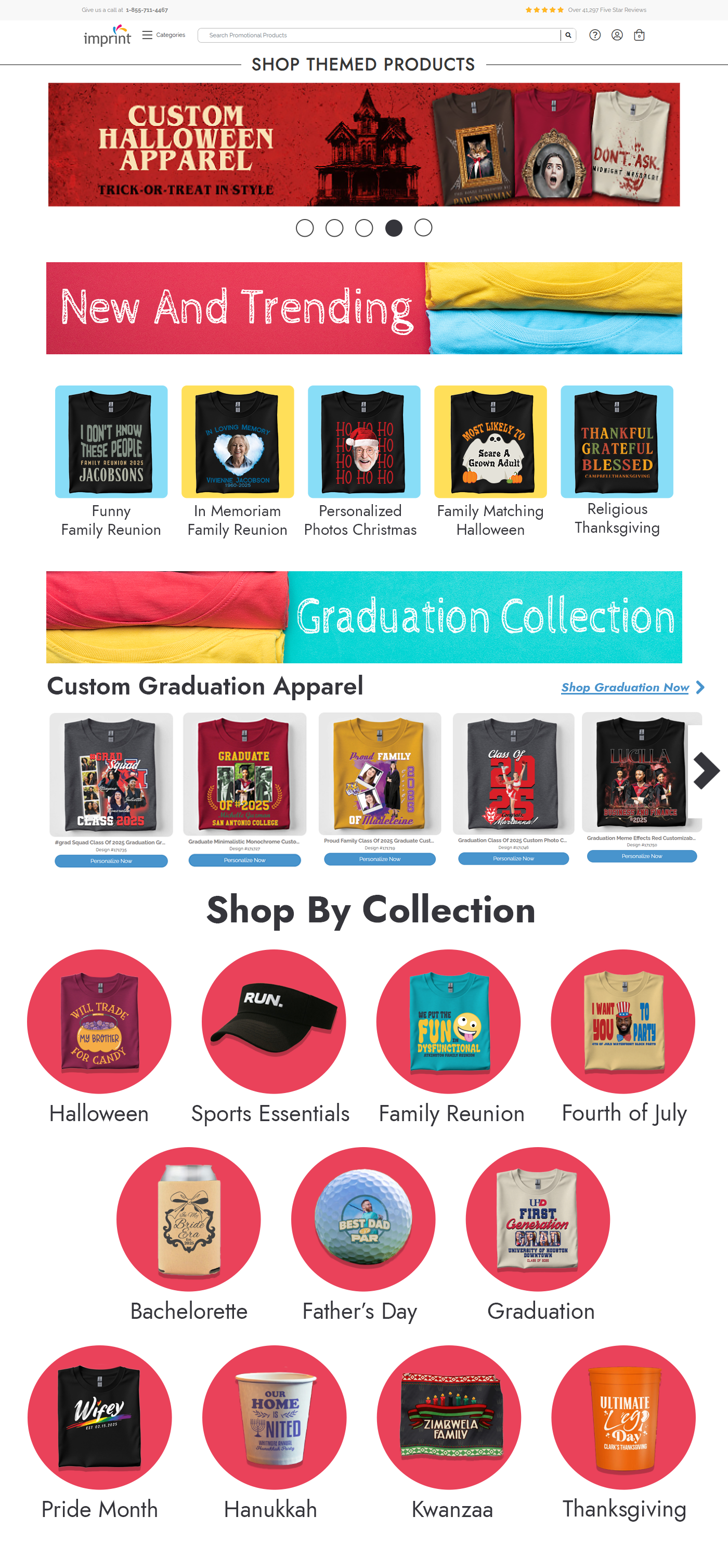
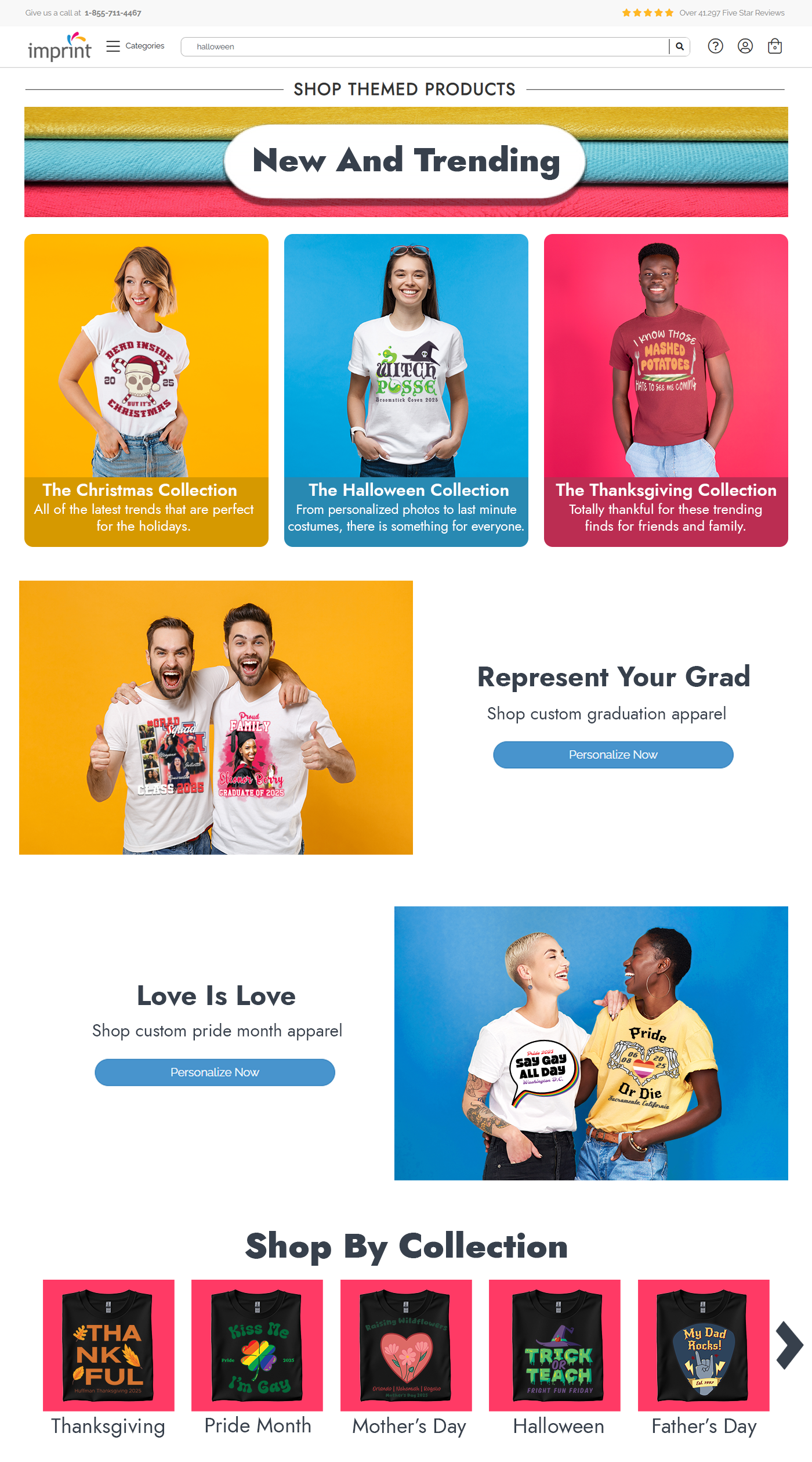
The Design Pivot: Products vs. People
The Pivot: I stripped back the noise for the second mockup, focusing on a human-centered design. By using models to represent the customer's experience, I created a more open, inviting interface that feels less like a catalog and more like a celebration of the holidays.
Attempt 1: A high-energy concept utilizing the full brand spectrum of yellow, blue, and red to grab attention. While vibrant, the layout felt cluttered and overly focused on the "hard sell".
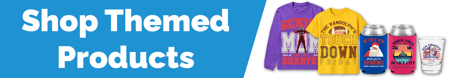
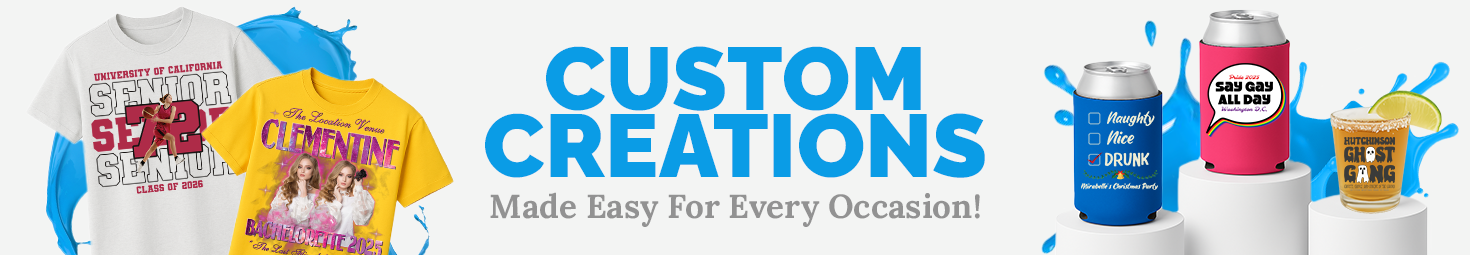
Banner Design: Draft vs. Final
The brief required the Jost typeface, but the visual direction was open. I chose to anchor the design in our primary company colors to connect with the main brand identity. The Pivot: The first attempt felt a little flat, so I injected more personality into the second draft. By adding blue paint splashes—a nod to the design elements on our homepage—I created a dynamic backdrop that really made the product lineup pop.
Refining the "New and Trending" Row
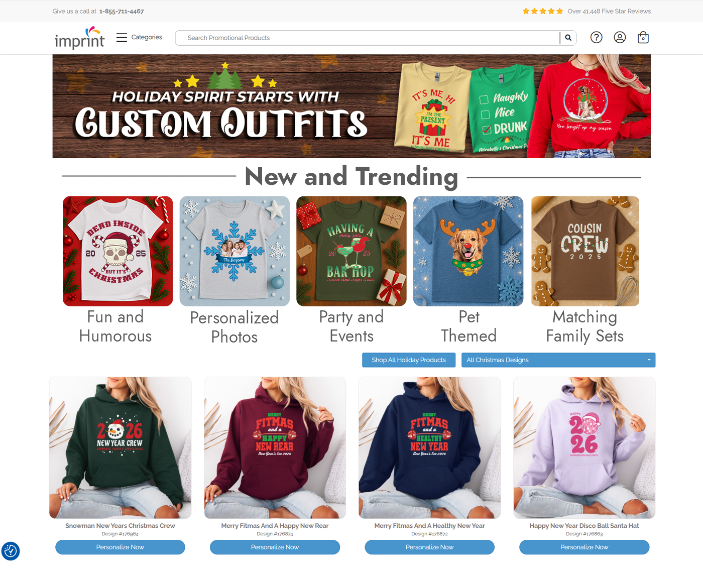
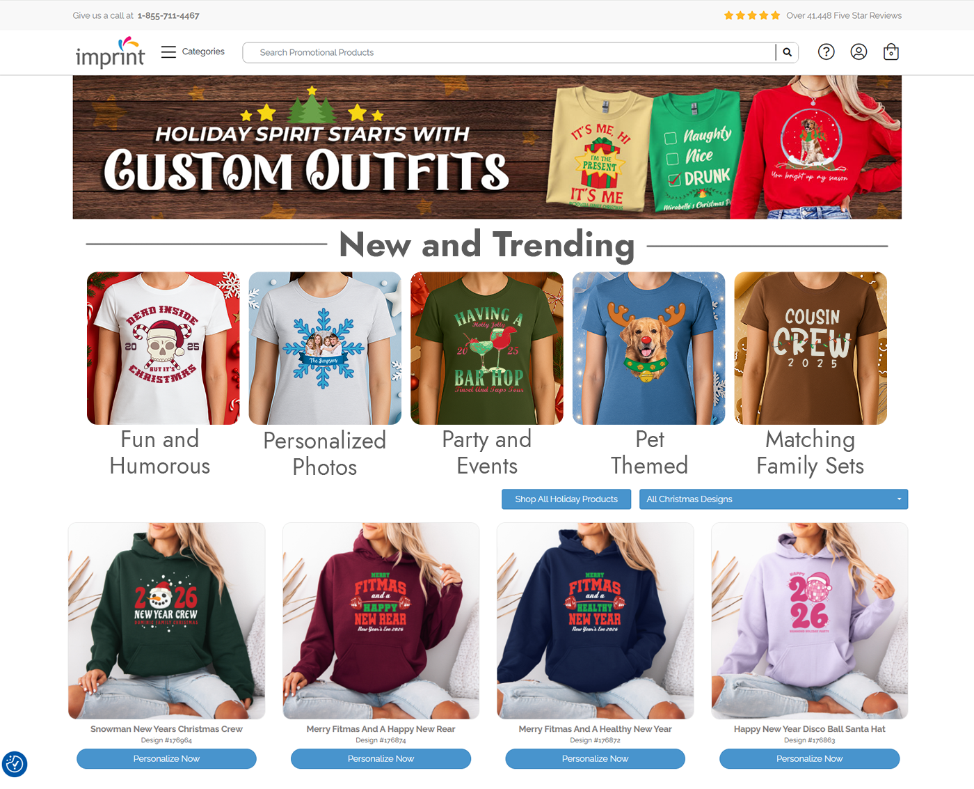
When designing the Christmas apparel page, I experimented with two distinct visual strategies. My first pass was a clean, product-focused approach, using isolated t-shirt thumbnails to highlight the graphics. While functional, it felt a bit static. I pivoted to a human-centered approach for the final version, swapping the flat lays for models. This instantly added warmth and context, helping customers picture themselves in the gear rather than just looking at a catalog.